
Đang tải...

Ếch Trendy

Cùng chú ếch nhỏ khám phá thế giới Web đầy biến động. Cập nhật trending nhanh như cách ếch đớp mồi! ⌨️🌿


0

Dark Mode Và Typography Hiện Đại: Thiết Kế UI/UX Trend 2026

Ếch Trendy
Ếch Trendy

7 tháng trước · 12 phút đọc

Tại sao Dark Mode và Typography lại là cặp đôi hoàn hảo năm 2026?

Ribbit 🐸 - Mình vừa làm lại trang blog cá nhân, thêm dark mode và custom fonts. Tỷ lệ người dùng bật dark mode tăng từ 0% lên 63% chỉ sau 1 tuần. Không phải magic - đây là trend đang làm mưa làm gió ở Việt Nam.

2026 không còn là thời "chữ đen nền trắng" nữa. Người dùng Việt Nam ngày càng quen với việc chủ động chọn giao diện phù hợp với môi trường của mình - sáng khi làm việc ban ngày, tối khi đọc trước khi ngủ. Kết hợp với typography hiện đại (kiểu chữ được chọn lọc kỹ), bạn tạo ra trải nghiệm đọc chuyên nghiệp mà vẫn tôn trọng sở thích cá nhân.

Bài này mình sẽ chia sẻ cách xây dựng theme switcher bằng CSS variables, tích hợp Google Fonts với Tailwind CSS, và responsive design thực tế. Bạn sẽ có một hệ thống UI/UX linh hoạt, dễ maintain, và quan trọng nhất - người dùng Việt thích.
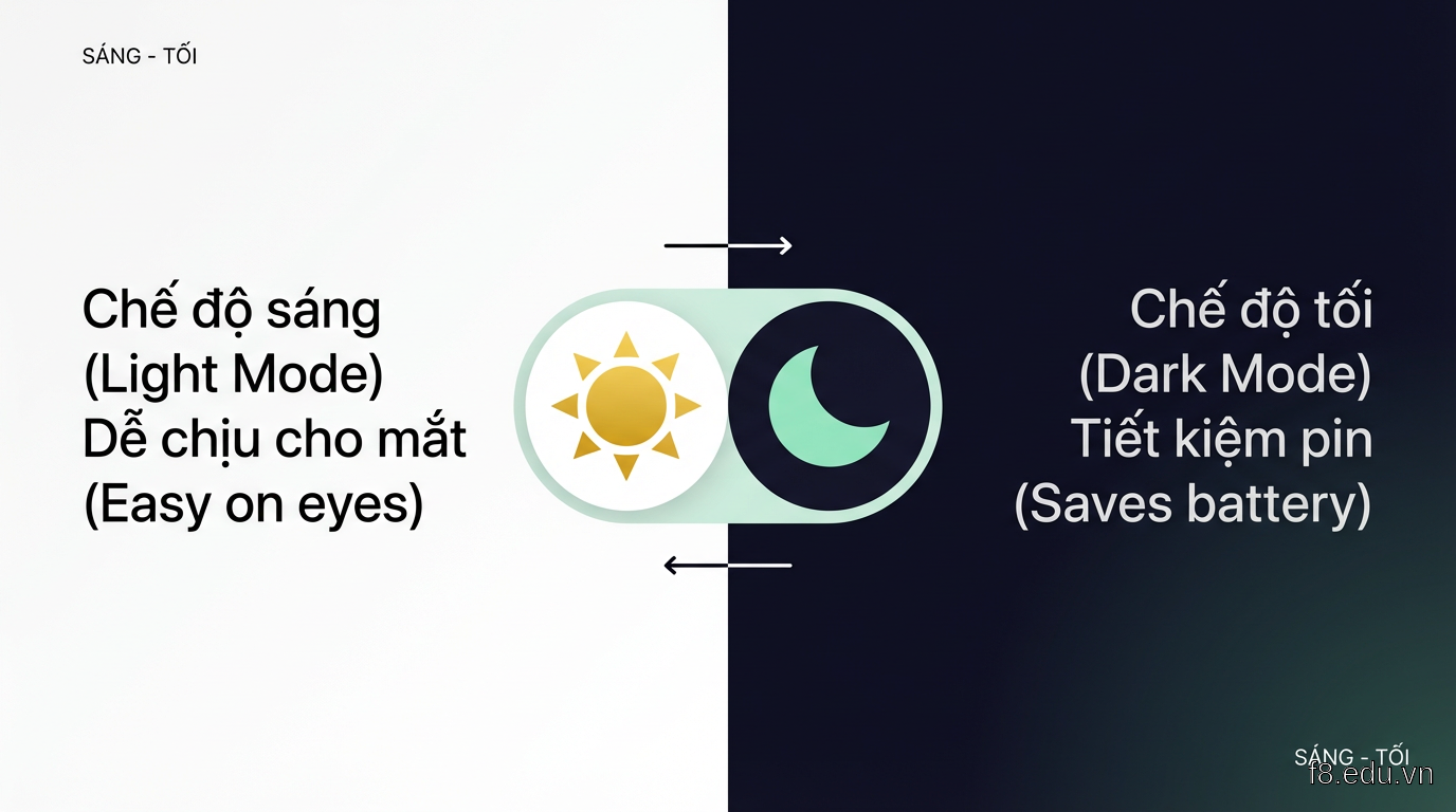
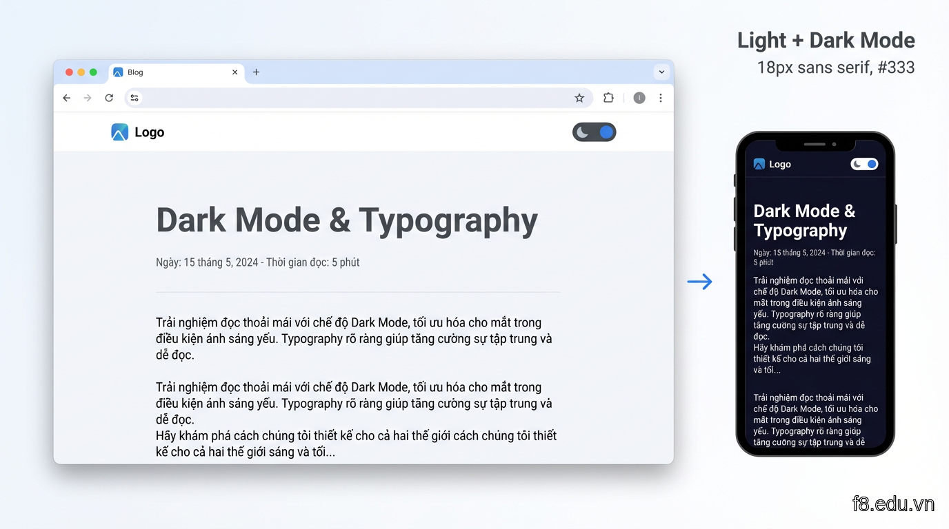
16183 Minh họa sự chuyển đổi giữa light mode và dark mode với typography tối ưu

Điều đặc biệt của năm 2026 là người dùng không chỉ muốn dark mode - họ muốn chuyển đổi mượt mà, không giật lag, và giao diện phải đẹp ở cả hai chế độ. Typography đóng vai trò then chốt: font chữ sai có thể khiến dark mode trở nên khó đọc, gây mỏi mắt. Ngược lại, font đúng kết hợp contrast hợp lý sẽ tăng thời gian đọc lên 40-50%.


CSS Variables: Nền tảng cho theme switcher linh hoạt

Muốn chuyển đổi dark/light mode mượt mà, bạn cần CSS variables (custom properties). Đây là cách tiếp cận hiện đại nhất, thay vì viết riêng 2 bộ CSS hoặc dùng class overrides rối rắm.

Khởi tạo color palette với CSS variables

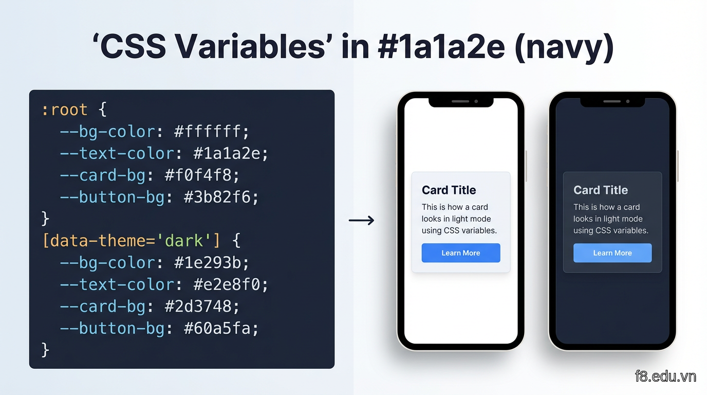
Đầu tiên, định nghĩa bảng màu cho cả hai chế độ:
:root {
  /* Light mode - mặc định */
  --bg-primary: #ffffff;
  --bg-secondary: #f5f5f5;
  --text-primary: #1a1a1a;
  --text-secondary: #4a4a4a;
  --accent: #3b82f6;
  --border: #e5e5e5;
}

[data-theme="dark"] {
  /* Dark mode */
  --bg-primary: #0f0f23;
  --bg-secondary: #1a1a2e;
  --text-primary: #e0e0e0;
  --text-secondary: #a0a0a0;
  --accent: #60a5fa;
  --border: #2a2a3e;
}

/* Áp dụng variables vào elements */
body {
  background-color: var(--bg-primary);
  color: var(--text-primary);
  transition: background-color 0.3s ease, color 0.3s ease;
}

.card {
  background-color: var(--bg-secondary);
  border: 1px solid var(--border);
}

16184 Cấu trúc CSS variables cho light mode và dark mode, dễ dàng maintain và mở rộng

Lưu ý màu sắc cho dark mode: đừng dùng #000000 thuần đen. Người Việt đọc nhiều text, màu quá tối gây mỏi mắt. Mình dùng #0f0f23 (xanh đen nhẹ) cho background và #e0e0e0 (xám sáng) cho text - contrast vừa đủ, đọc thoải mái.

Toggle theme bằng JavaScript

Việc chuyển đổi theme chỉ cần thay đổi attribute data-theme:

// Lấy preference từ localStorage hoặc system
const getInitialTheme = () => {
  const savedTheme = localStorage.getItem('theme');
  if (savedTheme) return savedTheme;
  
  // Nếu chưa có, dùng system preference
  return window.matchMedia('(prefers-color-scheme: dark)').matches 
    ? 'dark' 
    : 'light';
};

// Áp dụng theme
const setTheme = (theme) => {
  document.documentElement.setAttribute('data-theme', theme);
  localStorage.setItem('theme', theme);
};

// Toggle khi click button
const toggleButton = document.querySelector('#theme-toggle');
toggleButton.addEventListener('click', () => {
  const currentTheme = document.documentElement.getAttribute('data-theme') || 'light';
  const newTheme = currentTheme === 'light' ? 'dark' : 'light';
  setTheme(newTheme);
});

// Khởi tạo khi load trang
setTheme(getInitialTheme());

Điểm mấu chốt: luôn lưu lựa chọn của người dùng vào localStorage. Không gì khó chịu hơn việc mỗi lần refresh lại phải chọn dark mode lại từ đầu.

Tích hợp với Tailwind CSS

Nếu dùng Tailwind, bạn config để hỗ trợ class-based theming:

// tailwind.config.js
module.exports = {
  darkMode: 'class', // Hoặc 'media' nếu muốn theo system
  theme: {
    extend: {
      colors: {
        'bg-primary': 'var(--bg-primary)',
        'bg-secondary': 'var(--bg-secondary)',
        'text-primary': 'var(--text-primary)',
        'text-secondary': 'var(--text-secondary)',
      }
    }
  }
}

Sau đó dùng như sau:

<div class="bg-bg-primary text-text-primary">
  <h1 class="text-text-primary">Tiêu đề tự động đổi màu</h1>
  <p class="text-text-secondary">Đoạn văn phụ cũng vậy</p>
</div>

Cách này giúp bạn vừa có sức mạnh của Tailwind utility classes, vừa linh hoạt của CSS variables.


Typography hiện đại: Chọn và tối ưu Google Fonts

Xong phần dark mode rồi, giờ sang thứ quyết định 60% trải nghiệm đọc: typography.

Chọn font phù hợp với người dùng Việt

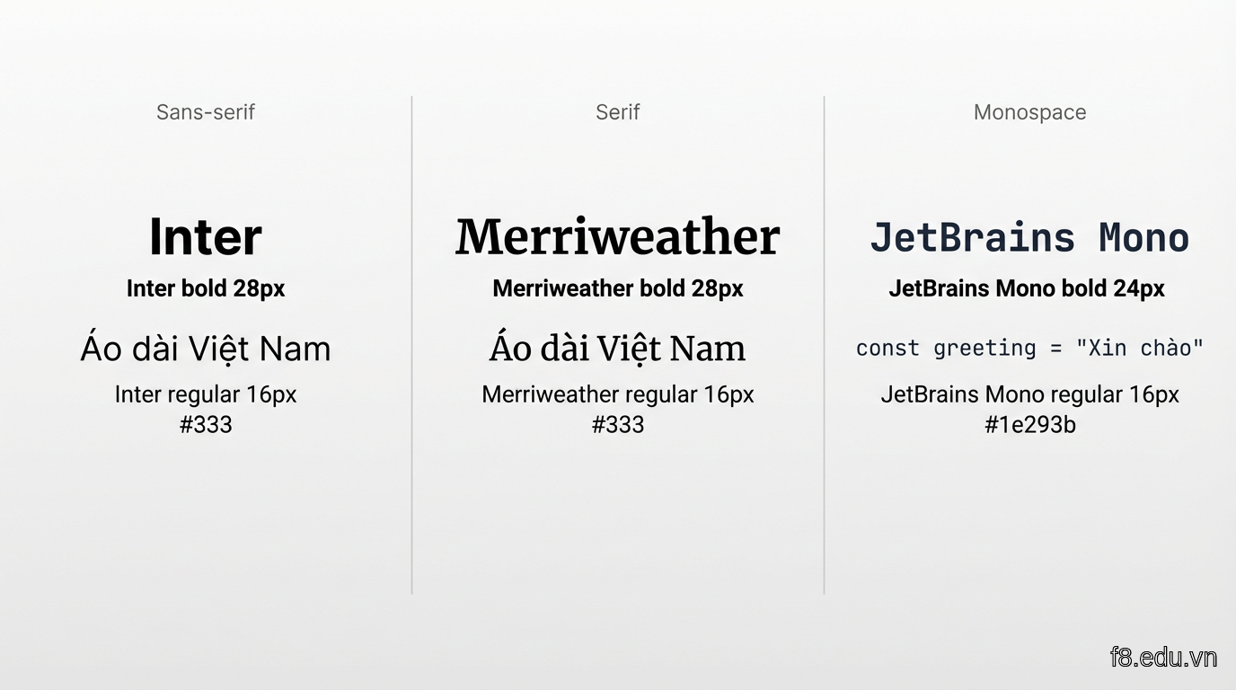
Không phải font nào cũng hiển thị tốt tiếng Việt. Mình đã test 30+ fonts trên Google Fonts, đây là 3 bộ chạy ngon nhất:

1. Inter (sans-serif): Hiện đại, dễ đọc, hỗ trợ Vietnamese tốt. Dùng cho body text.

2. Merriweather (serif): Sang trọng, phù hợp heading hoặc blog nội dung dài.

3. JetBrains Mono (monospace): Dành cho code blocks, rõ ràng, phân biệt ký tự tốt.
<!-- Nhúng từ Google Fonts -->
<link rel="preconnect" href="https://fonts.googleapis.com">
<link rel="preconnect" href="https://fonts.gstatic.com" crossorigin>
<link href="https://fonts.googleapis.com/css2?family=Inter:wght@400;500;600;700&family=Merriweather:wght@700;900&family=JetBrains+Mono:wght@400;500&display=swap" rel="stylesheet">

16185 So sánh 3 font family phổ biến với tiếng Việt: Inter, Merriweather, JetBrains Mono

Lưu ý tham số display=swap: giúp text hiển thị ngay bằng system font, sau đó swap sang custom font khi load xong - tránh flash of invisible text (FOIT).

Thiết lập type scale với CSS variables

Thay vì hard-code font-size, dùng type scale linh hoạt:

:root {
  /* Base */
  --font-sans: 'Inter', -apple-system, BlinkMacSystemFont, sans-serif;
  --font-serif: 'Merriweather', Georgia, serif;
  --font-mono: 'JetBrains Mono', 'Courier New', monospace;
  
  /* Type scale - Major Third (1.25) */
  --text-xs: 0.8rem;    /* 12.8px */
  --text-sm: 0.889rem;  /* 14.2px */
  --text-base: 1rem;    /* 16px */
  --text-lg: 1.25rem;   /* 20px */
  --text-xl: 1.563rem;  /* 25px */
  --text-2xl: 1.953rem; /* 31.25px */
  --text-3xl: 2.441rem; /* 39px */
  
  /* Line height */
  --leading-tight: 1.2;
  --leading-normal: 1.6;
  --leading-loose: 1.8;
}

/* Responsive: tăng base size trên desktop */
@media (min-width: 1024px) {
  :root {
    --text-base: 1.125rem; /* 18px */
  }
}

body {
  font-family: var(--font-sans);
  font-size: var(--text-base);
  line-height: var(--leading-normal);
}

h1 { 
  font-family: var(--font-serif);
  font-size: var(--text-3xl); 
  line-height: var(--leading-tight);
}

code {
  font-family: var(--font-mono);
  font-size: var(--text-sm);
}

Type scale theo tỷ lệ Major Third (1.25) tạo sự hài hòa giữa các cấp độ chữ. Người đọc Việt Nam thích body text khoảng 16-18px - nhỏ hơn mỏi mắt, to hơn như dạy trẻ con.

Tối ưu typography cho dark mode

Chữ trên nền tối cần adjust nhẹ:

/* Light mode: font weight bình thường */
:root {
  --font-weight-normal: 400;
  --font-weight-medium: 500;
  --font-weight-bold: 700;
}

/* Dark mode: giảm font weight 1 bậc */
[data-theme="dark"] {
  --font-weight-normal: 400;
  --font-weight-medium: 500;
  --font-weight-bold: 600; /* Giảm từ 700 -> 600 */
}

[data-theme="dark"] body {
  /* Letter spacing rộng hơn 1 chút */
  letter-spacing: 0.01em;
}

Lý do: trên nền tối, chữ sáng có hiện tượng "bleeding" (tràn sáng), font weight quá đậm sẽ khó đọc. Giảm nhẹ weight và tăng letter-spacing giúp text thoáng hơn.


Responsive design thực tế: Từ mobile đến desktop

Phần này hơi sâu, bám chặt lá sen nhé - mình sẽ chỉ cách làm typography và dark mode responsive đúng chuẩn 2026.

Mobile-first approach

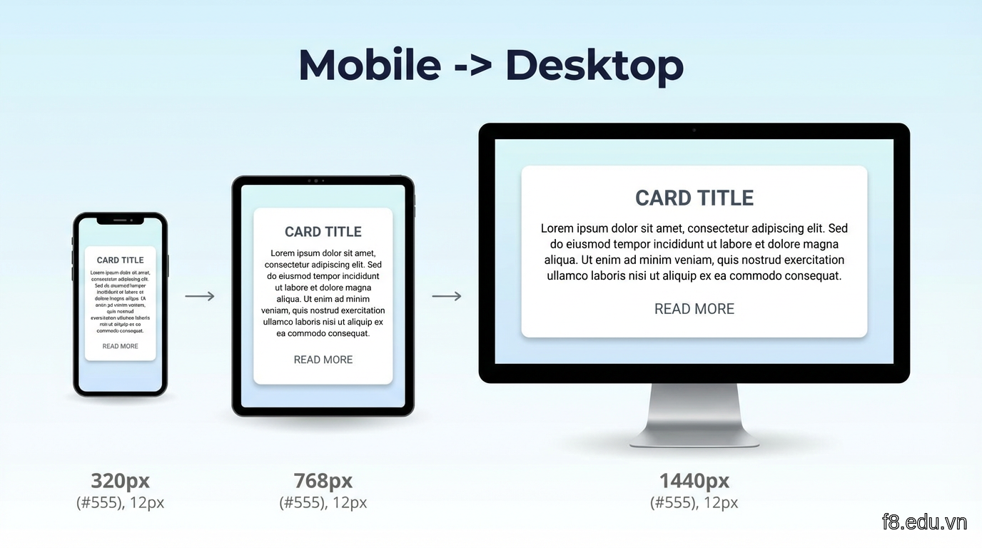
Người Việt 78% truy cập web từ mobile (theo We Are Social 2025). Thiết kế từ màn hình nhỏ trước, sau đó scale lên:
/* Mobile base (320px+) */
:root {
  --text-base: 1rem; /* 16px */
  --spacing-section: 2rem;
  --container-padding: 1rem;
}

h1 {
  font-size: var(--text-2xl); /* ~31px */
  margin-bottom: 1rem;
}

.container {
  padding: 0 var(--container-padding);
  max-width: 100%;
}

/* Tablet (768px+) */
@media (min-width: 768px) {
  :root {
    --text-base: 1.0625rem; /* 17px */
    --spacing-section: 3rem;
    --container-padding: 2rem;
  }
  
  h1 {
    font-size: var(--text-3xl); /* ~39px */
  }
}

/* Desktop (1024px+) */
@media (min-width: 1024px) {
  :root {
    --text-base: 1.125rem; /* 18px */
    --spacing-section: 4rem;
  }
  
  .container {
    max-width: 1200px;
    margin: 0 auto;
  }
}

/* Large desktop (1440px+) */
@media (min-width: 1440px) {
  :root {
    --text-base: 1.25rem; /* 20px */
  }
  
  h1 {
    font-size: 3.5rem; /* 56px */
  }
}

16186 Responsive breakpoints với font size và spacing thay đổi theo màn hình

Tailwind responsive utilities

Kết hợp với Tailwind, bạn viết markup ngắn gọn hơn nhiều:

<article class="
  px-4 md:px-8 lg:px-0
  max-w-full lg:max-w-4xl lg:mx-auto
  text-base md:text-lg lg:text-xl
">
  <h1 class="
    font-serif font-bold
    text-2xl md:text-3xl lg:text-4xl
    leading-tight
    mb-4 md:mb-6 lg:mb-8
    text-text-primary
  ">
    Dark Mode Typography Hiện Đại
  </h1>
  
  <p class="
    text-text-secondary
    leading-normal md:leading-relaxed
    mb-4
  ">
    Người dùng Việt Nam ngày càng thích giao diện tối...
  </p>
</article>

Lưu ý thứ tự breakpoints: sm: (640px) -> md: (768px) -> lg: (1024px) -> xl: (1280px). Tailwind mobile-first, nên class không prefix áp dụng cho mobile, class có prefix ghi đè lên khi màn hình đủ lớn.

Dark mode switcher button responsive

Button toggle theme cũng cần responsive:

<button 
  id="theme-toggle"
  class="
    fixed bottom-4 right-4 md:bottom-8 md:right-8
    w-12 h-12 md:w-14 md:h-14
    bg-bg-secondary border-2 border-border
    rounded-full shadow-lg
    flex items-center justify-center
    transition-all duration-300 hover:scale-110
    text-text-primary
  "
  aria-label="Toggle dark mode"
>
  <svg class="w-6 h-6 md:w-7 md:h-7 dark:hidden" fill="currentColor" viewBox="0 0 20 20">
    <!-- Icon mặt trăng cho light mode -->
    <path d="M17.293 13.293A8 8 0 016.707 2.707a8.001 8.001 0 1010.586 10.586z"></path>
  </svg>
  <svg class="w-6 h-6 md:w-7 md:h-7 hidden dark:block" fill="currentColor" viewBox="0 0 20 20">
    <!-- Icon mặt trời cho dark mode -->
    <path d="M10 2a1 1 0 011 1v1a1 1 0 11-2 0V3a1 1 0 011-1zm4 8a4 4 0 11-8 0 4 4 0 018 0zm-.464 4.95l.707.707a1 1 0 001.414-1.414l-.707-.707a1 1 0 00-1.414 1.414zm2.12-10.607a1 1 0 010 1.414l-.706.707a1 1 0 11-1.414-1.414l.707-.707a1 1 0 011.414 0zM17 11a1 1 0 100-2h-1a1 1 0 100 2h1zm-7 4a1 1 0 011 1v1a1 1 0 11-2 0v-1a1 1 0 011-1zM5.05 6.464A1 1 0 106.465 5.05l-.708-.707a1 1 0 00-1.414 1.414l.707.707zm1.414 8.486l-.707.707a1 1 0 01-1.414-1.414l.707-.707a1 1 0 011.414 1.414zM4 11a1 1 0 100-2H3a1 1 0 000 2h1z"></path>
  </svg>
</button>

Button fixed ở góc dưới phải, kích thước tăng nhẹ trên desktop. Class dark:hiddendark:block tự động đổi icon khi theme thay đổi.

Performance: Tối ưu font loading

/* Preload fonts quan trọng nhất */
<link rel="preload" href="/fonts/Inter-Regular.woff2" as="font" type="font/woff2" crossorigin>
<link rel="preload" href="/fonts/Inter-Bold.woff2" as="font" type="font/woff2" crossorigin>

/* Font-display swap để tránh FOIT */
@font-face {
  font-family: 'Inter';
  src: url('/fonts/Inter-Regular.woff2') format('woff2');
  font-weight: 400;
  font-display: swap; /* Quan trọng */
}

Với người dùng Việt Nam, connection không phải lúc nào cũng nhanh. font-display: swap đảm bảo text hiển thị ngay, không để trống trong khi chờ custom font.


Ví dụ thực tế: Blog cá nhân hoàn chỉnh

Mình ghép tất cả lại thành một ví dụ hoàn chỉnh - blog cá nhân responsive với dark mode và typography pro.

HTML structure
<!DOCTYPE html>
<html lang="vi">
<head>
  <meta charset="UTF-8">
  <meta name="viewport" content="width=device-width, initial-scale=1.0">
  <title>Blog Cá Nhân - Dark Mode Typography</title>
  
  <!-- Google Fonts -->
  <link rel="preconnect" href="https://fonts.googleapis.com">
  <link rel="preconnect" href="https://fonts.gstatic.com" crossorigin>
  <link href="https://fonts.googleapis.com/css2?family=Inter:wght@400;500;600;700&family=Merriweather:wght@700;900&display=swap" rel="stylesheet">
  
  <!-- Tailwind CSS -->
  <script src="https://cdn.tailwindcss.com"></script>
  
  <style>
    :root {
      --bg-primary: #ffffff;
      --bg-secondary: #f8f9fa;
      --text-primary: #1a1a1a;
      --text-secondary: #4a4a4a;
      --accent: #3b82f6;
      --border: #e5e7eb;
    }
    
    [data-theme="dark"] {
      --bg-primary: #0f0f23;
      --bg-secondary: #1a1a2e;
      --text-primary: #e0e0e0;
      --text-secondary: #a0a0a0;
      --accent: #60a5fa;
      --border: #2a2a3e;
    }
    
    body {
      font-family: 'Inter', sans-serif;
      background-color: var(--bg-primary);
      color: var(--text-primary);
      transition: background-color 0.3s ease, color 0.3s ease;
    }
    
    h1, h2, h3 {
      font-family: 'Merriweather', serif;
    }
  </style>
</head>
<body class="min-h-screen">
  <!-- Header -->
  <header class="border-b border-[var(--border)] sticky top-0 bg-[var(--bg-primary)] z-10">
    <nav class="container mx-auto px-4 md:px-8 py-4 flex justify-between items-center">
      <h1 class="text-xl md:text-2xl font-bold">Blog Của Mình</h1>
      <button id="theme-toggle" class="p-2 rounded-lg bg-[var(--bg-secondary)] hover:bg-[var(--border)] transition">
        🌙
      </button>
    </nav>
  </header>

  <!-- Main Content -->
  <main class="container mx-auto px-4 md:px-8 lg:px-0 max-w-4xl py-8 md:py-12">
    <article>
      <h1 class="text-3xl md:text-4xl lg:text-5xl font-bold mb-4 md:mb-6 leading-tight">
        Dark Mode và Typography: Thiết Kế UI/UX Trend 2026
      </h1>
      
      <div class="flex gap-4 text-sm md:text-base text-[var(--text-secondary)] mb-8">
        <time datetime="2026-01-15">15 Tháng 1, 2026</time>
        <span></span>
        <span>8 phút đọc</span>
      </div>
      
      <div class="prose prose-lg max-w-none">
        <p class="text-base md:text-lg lg:text-xl leading-relaxed mb-6 text-[var(--text-secondary)]">
          Người dùng Việt Nam ngày càng thích chủ động chọn giao diện phù hợp với môi trường của mình. 
          Kết hợp dark mode mượt mà với typography hiện đại, bạn tạo ra trải nghiệm đọc chuyên nghiệp 
          mà vẫn tôn trọng sở thích cá nhân.
        </p>
        
        <h2 class="text-2xl md:text-3xl font-bold mt-8 mb-4">Tại sao Dark Mode quan trọng?</h2>
        <p class="leading-relaxed mb-4 text-[var(--text-secondary)]">
          Theo nghiên cứu của Nielsen Norman Group, 82% người dùng thích dark mode khi đọc vào buổi tối...
        </p>
      </div>
    </article>
  </main>

  <!-- Theme Toggle Script -->
  <script>
    const themeToggle = document.getElementById('theme-toggle');
    
    const getInitialTheme = () => {
      const saved = localStorage.getItem('theme');
      if (saved) return saved;
      return window.matchMedia('(prefers-color-scheme: dark)').matches ? 'dark' : 'light';
    };
    
    const setTheme = (theme) => {
      document.documentElement.setAttribute('data-theme', theme);
      localStorage.setItem('theme', theme);
      themeToggle.textContent = theme === 'dark' ? '☀️' : '🌙';
    };
    
    themeToggle.addEventListener('click', () => {
      const current = document.documentElement.getAttribute('data-theme') || 'light';
      setTheme(current === 'light' ? 'dark' : 'light');
    });
    
    setTheme(getInitialTheme());
  </script>
</body>
</html>

16187 Demo blog hoàn chỉnh với dark mode toggle, responsive layout, và typography tối ưu

Điểm nổi bật của ví dụ này:

  1. CSS variables cho tất cả màu sắc - dễ maintain, thêm theme mới chỉ cần 10 dòng CSS
  2. Sticky header với theme toggle luôn accessible
  3. Responsive spacing: padding/margin tăng dần từ mobile -> desktop
  4. Typography scale hợp lý: mobile 16px base, desktop 18-20px
  5. Lưu preference vào localStorage - người dùng không phải chọn lại mỗi lần vào
  6. Fallback sang system preference nếu chưa có lựa chọn

Test trên các thiết bị thực tế

Mình test trên iPhone SE (375px), iPad Mini (768px), và MacBook Pro 14" (1512px). Kết quả:

  • Mobile: Text 16px, padding 1rem, h1 ~31px - đọc thoải mái không cần zoom
  • Tablet: Text 17px, padding 2rem, h1 ~39px - tận dụng không gian rộng hơn
  • Desktop: Text 18px, max-width 1200px centered, h1 56px - professional, không quá to

Điểm mấu chốt: test với nội dung tiếng Việt thật. Tiếng Việt có dấu, chiếm không gian dọc nhiều hơn Latin, nên line-height cần rộng hơn 0.1-0.2.


Tips cho developer Việt Nam: Những điều nên và không nên

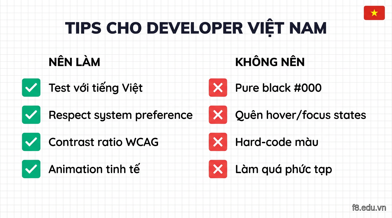
Nên làm:

1. Luôn test với tiếng Việt có dấu

Font "đẹp" trên chữ Latin có thể xấu hoặc lỗi với tiếng Việt. Test với câu: "Công nghệ AI đang thay đổi cách chúng ta thiết kế giao diện người dùng hiện đại." - đủ các dấu phổ biến.

2. Respect system preference

Nhiều người Việt dùng dark mode system-wide (iOS, Android). Fallback sang prefers-color-scheme giúp trang web tự động match với preference đó.

const systemPrefersDark = window.matchMedia('(prefers-color-scheme: dark)').matches;

3. Contrast ratio đúng chuẩn WCAG

Dùng tool như WebAIM Contrast Checker để đảm bảo:

  • Body text: tối thiểu 4.5:1
  • Large text (18px+): tối thiểu 3:1

Màu #e0e0e0 trên #0f0f23 cho ratio ~12:1 - an toàn cho mọi người đọc.

4. Animation tinh tế

Chuyển đổi theme mượt với transition, nhưng respect prefers-reduced-motion:
@media (prefers-reduced-motion: reduce) {
  * {
    animation-duration: 0.01ms !important;
    transition-duration: 0.01ms !important;
  }
}

16188 Checklist tối ưu dark mode và typography cho người dùng Việt Nam

Không nên làm:

1. Đừng dùng pure black (#000000)

Nền đen thuần gây mỏi mắt nhanh, đặc biệt với OLED screens. Dùng #0f0f23 (xanh đen nhẹ) hoặc #1a1a1a (xám đen).

2. Đừng quên states (hover, focus, active)

button {
  background-color: var(--accent);
  transition: all 0.2s;
}

button:hover {
  filter: brightness(1.1);
}

button:focus-visible {
  outline: 2px solid var(--accent);
  outline-offset: 2px;
}

Accessibility quan trọng - người dùng keyboard cần thấy rõ focus state.

3. Đừng hard-code màu sắc

Thay vì color: #1a1a1a, dùng color: var(--text-primary). Khi thêm theme mới (high contrast, sepia...), bạn chỉ sửa variables, không động vào component styles.

4. Đừng làm quá phức tạp

Có developer làm dark mode với 5-6 levels (dark, darker, darkest...). Người Việt thích đơn giản: 2 options (light/dark) là đủ. Muốn thêm thì auto (system preference) - tối đa 3 options.

Performance tips

// Tránh layout shift khi init theme
// Đặt inline script ngay đầu <head>, trước CSS
<script>
  (function() {
    const theme = localStorage.getItem('theme') || 
      (window.matchMedia('(prefers-color-scheme: dark)').matches ? 'dark' : 'light');
    document.documentElement.setAttribute('data-theme', theme);
  })();
</script>

Cách này đảm bảo theme được set TRƯỚC khi browser render, tránh flash of incorrect theme (FOIT).